SocialDark UINext.js
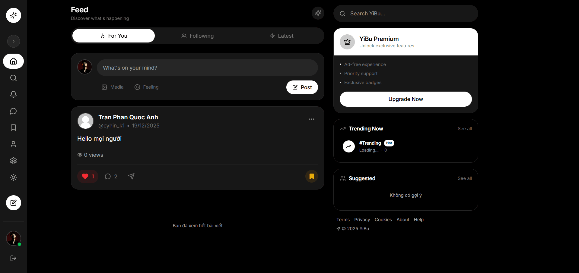
A three-column social layout that became the visual core of Yibu: icon-only sidebar, tabbed feed with a compose box, and a right rail for trending and suggestions. Specced dark-first; every surface defined before any light-mode class existed.
- UI Experiment
- Social feed layout
- ~1 week
- Solo — code & design
- Web (responsive)
- Next.js · TypeScript · Tailwind CSS
The layout experiment behind Yibu's feed. Three columns, one rule: the middle column is the product; the side columns must never out-shout it.
The tab bar is a query key. For You / Following / Latest are different queries with different cursors, not local UI state — switching tabs is a fetch, so back-button and URL state work for free.
Empty states are designed, not leftover. "You've seen all posts", "No suggestions" — these were specced before any real data existed. A feed that knows how to end feels finished; a feed that breaks feels broken.
The one inverted surface. The premium card is the only white element in the whole dark layout. On purpose: a single contrast event reads as an offer; a dozen read as noise.